Web & Mobile · Fintech
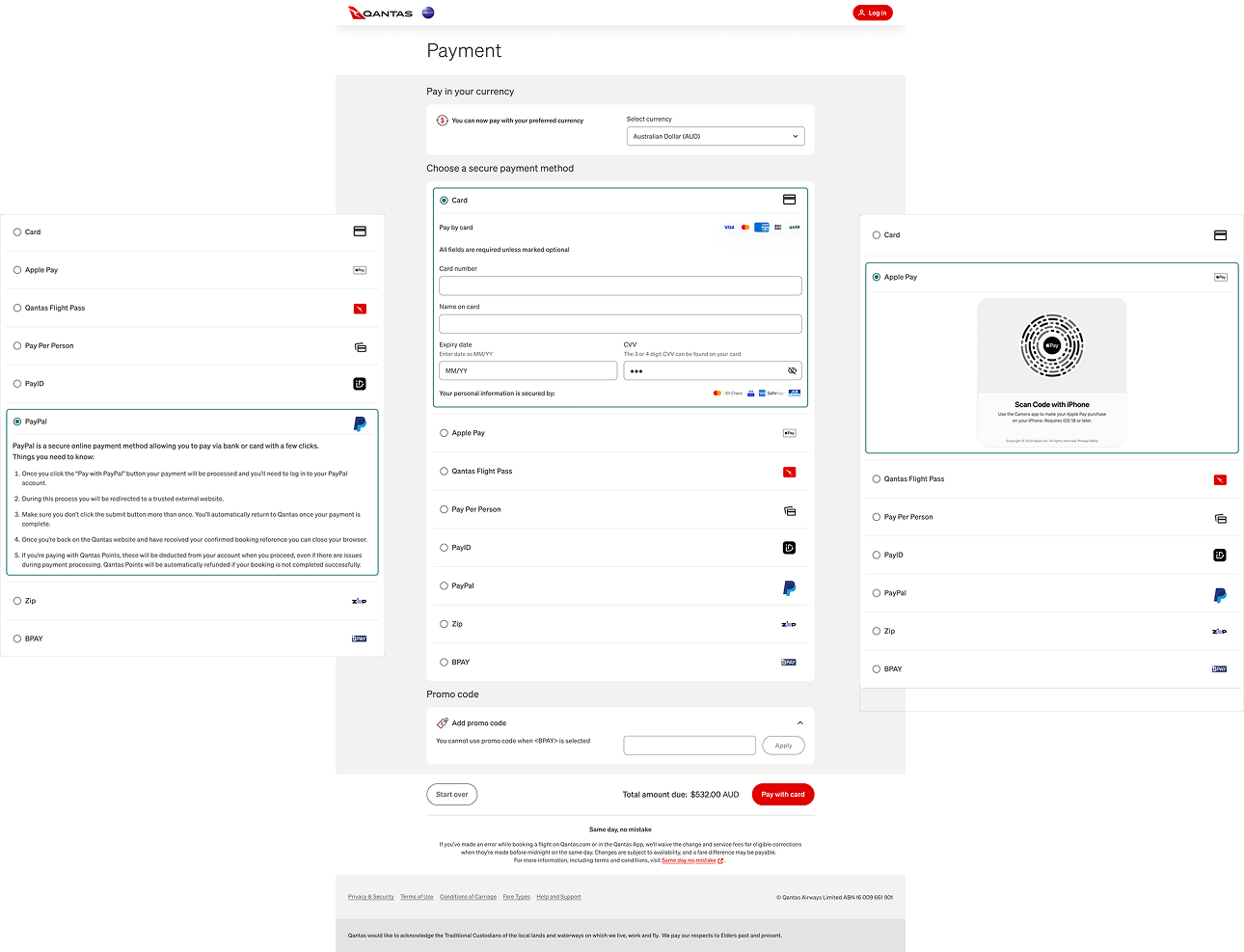
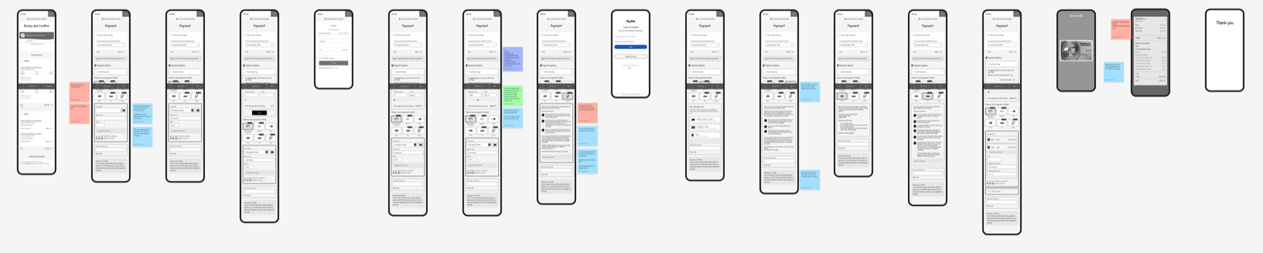
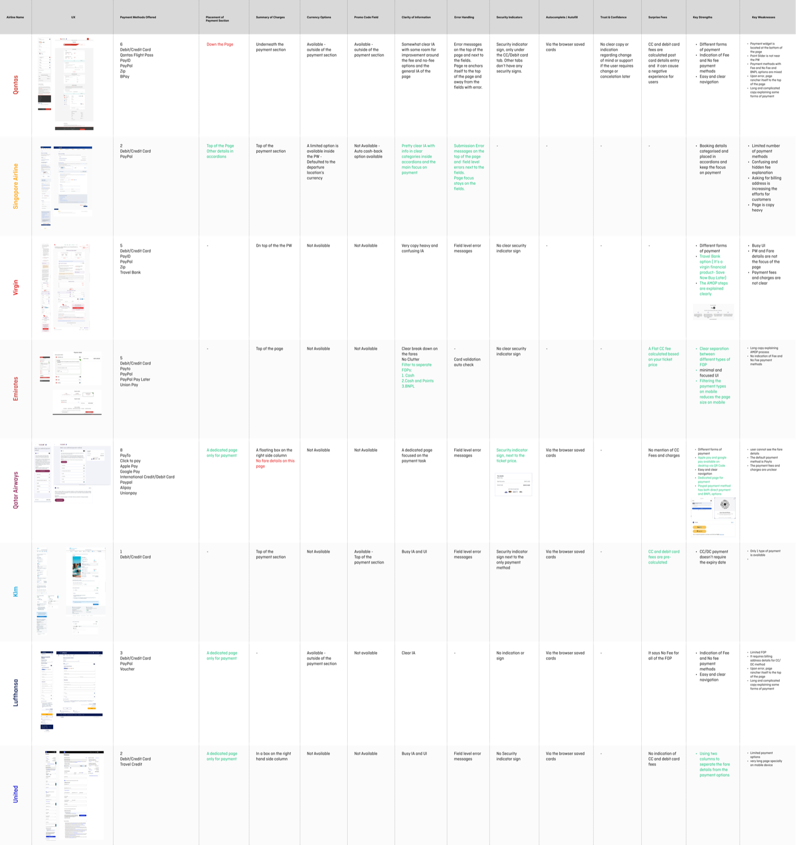
Qantas Payment Widget
Analysing the current state of the Qantas payment page — mapping customer problems, competitor benchmarks, and analytics to define a modular, omni-channel payment framework across web, mobile, and IoT touchpoints.