The asset finance arm of Resimac Group — designed for two completely different user groups, with a broker portal and clear, supportive journeys for everyday customers applying for finance.
resimacassetfinance.com.au is the asset finance arm of Resimac Group. The site needed to serve two completely different user groups simultaneously — direct customers who need guidance, reassurance, and clear product explanations to understand their options and apply with confidence, and brokers who need a fast, professional portal to submit and manage applications on behalf of their clients.
Designing a single digital experience that genuinely serves both audiences — without diluting either — required deliberate separation of journeys, content strategy tailored to each user's mental model, and a broker portal purpose-built for professional efficiency.
Separate interview series with everyday customers (seeking personal and commercial finance) and professional broker partners. Surfaced the gap in complexity, language, and priority between the two groups.
Dual personas, journey maps, and a content hierarchy that respected both audiences. Defined the entry-point routing logic that cleanly separates customer and broker flows without confusion at the homepage.
Site IA, wireframes, and high-fidelity designs across web and mobile. Customer journeys focused on plain-language product education and confident CTAs; the broker portal focused on speed, application management, and document handling.
Usability testing with both audience groups independently. Key iterations addressed homepage routing clarity, mobile application flow completion, and broker portal task efficiency before final handoff.
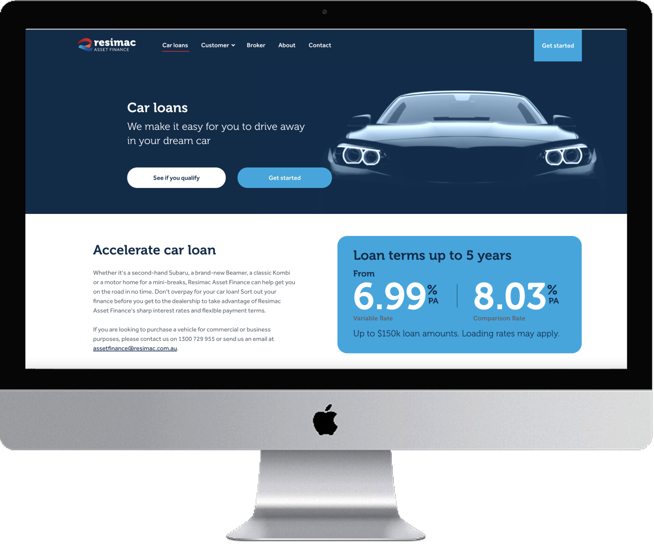
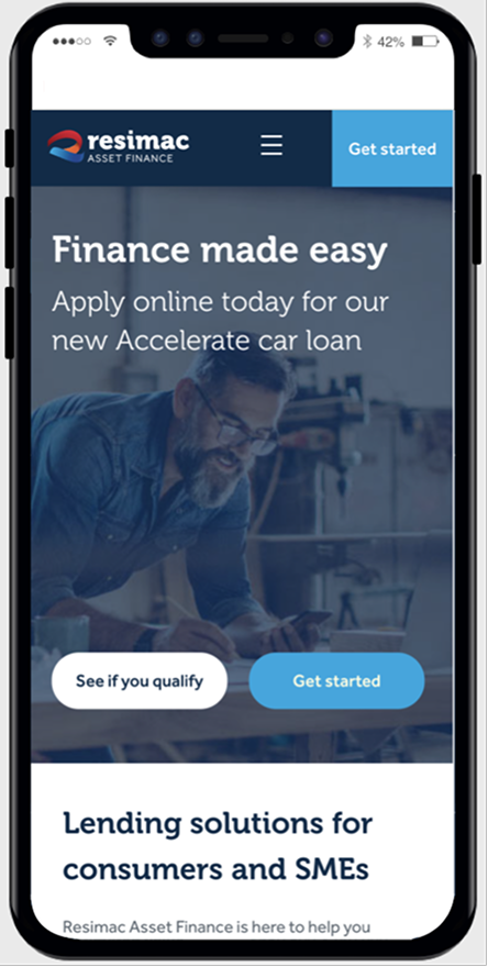
Everyday customers often arrive at a financial website uncertain about which product suits them and whether they even qualify. The customer-facing experience was designed to reduce that anxiety — leading with clear product headlines, transparent rate information, and low-commitment CTAs like "See if you qualify" before asking for any personal details. Progressive disclosure kept the application flow from feeling overwhelming on both desktop and mobile.
The broker portal, attached to the same website, was designed as a distinct professional tool — fast, functional, and built around how brokers actually work. With a Broker section surfaced clearly in the main navigation, brokers could enter their dedicated environment without ever intersecting with the customer journey.
The result was a single digital presence that felt tailored and relevant to two entirely different users — each confident they were in the right place.